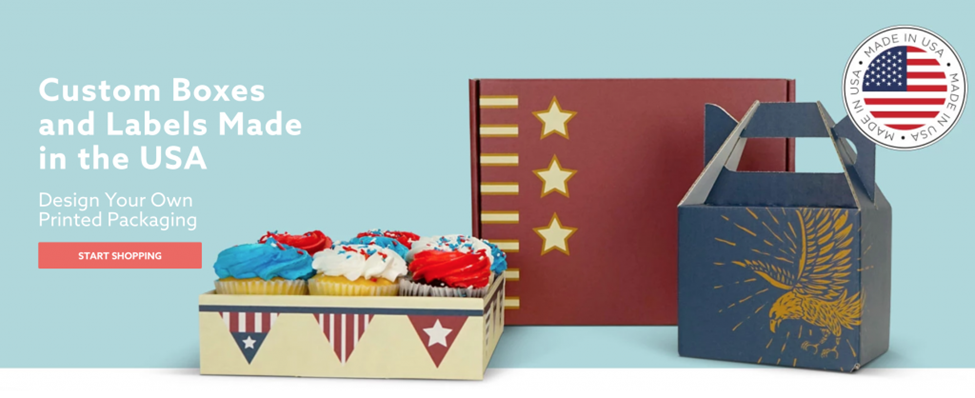
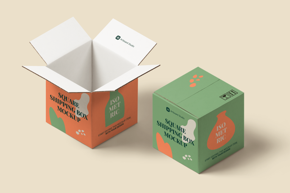
A good product packaging can trigger feelings and thoughts about your product and directly influence your customer’s purchase decision. This is because, on average, 78% of shoppers buy items packaged in printed packaging.
This is why choosing the best color or shade to design your packaging is crucial. How do you select the right palette that matches your brand, communicates your product’s features, helps you establish your identity, and attract your customers?
Choose the Right Color
Consumer buying behavior indicates how the colors of packaging can influence consumers.
Consider the buyer’s perspective. Your customers need to be able to identify the colors they choose. Take into account your market. Know their needs and motivations. What is their gender, age, and economic status? For example, the classic shade of red and yellow from McDonald’s symbolizes the youthful energy and enthusiasm with which the target audience can relate.
The product should be represented. Sometimes you need packaging to inform consumers about the ingredients of the product.
Be different from your competitors. Your product blends in with the shelves, but it has an impact. If you choose a different color from your competitors, your product will be noticed and remembered. For example, two of the largest brands of cold drinks, Coca-Cola and Pepsi, have different primary colors; blue and red. There are ways to discern the colors of your competitors’ packaging to help you make an informed choice.
The color should subliminally convey the message you intend to convey to buyers. Do you want them to see the product as relaxing or enjoyable? Are the products related to security or wellness? Does it inspire a sense of elegance or luxury? For example, Apple’s traditional shade of white creates the impression of elegance.
Make sure you consider branding. Don’t miss the opportunity to convey the voice of your brand. Your brand’s story should be perfectly intertwined with the colors and patterns of the packaging. Are you a professional and fun brand or rebellious? For example, T-mobile decided to adopt the bright pink color scheme when most other mobile service providers chose shades of blue, black, and red, creating a distinct and striking color.
Colors have meanings that are culturally based on them. Learn about your customers’ cultural and historic environment to create color combinations. For example, the color red symbolizes luck and prosperity in China.
Your colors can blend in with the packaging style and font you select. Although it may seem simple, it is not so difficult to be too imaginative and get carried away. The fonts you choose convey your message to your customers, and the colors must resonate with the message.
Although experimentation is excellent when packing new products, you must keep your brand identity and color scheme. Consumers must be aware of your brand, regardless of packaging or colors. For example, when Maaza introduced new bottles, they kept the same traditional red and yellow. The same thing can be done with shadow and shade.
It is essential to make this choice without understanding what subconsciously associates viewers with the most popular colors.

Psychology of Colors
Different shades of human behavior and emotions in a variety of ways. The person’s reaction to a specific color is involuntary and motivated by psychology. Black is a sophisticated choice, brown and gray can make the packaging more conservative or masculine, pink is a great feminine look, and red attracts attention.
Hue can also be a factor. They decide what color should be bright or dull because the different shades differ in their meaning.
White Color
White is a color used in commonly used packaging to show that it is light, classic, safe, and secure. Other colors often accentuate white to enhance or change the impression.
Black Color
In general, black is used to create state-of-the-art items because it symbolizes elegance. It conveys elegance and class. As with black and white, it can be enhanced by other colors. The silver or metallic print over matte black boxes gives an elegant look.
Blue Color
You need to think about potential customers before you go blue. Darker shades of blue often attract older people, while lighter and more vibrant shades attract younger consumers.
Red Color
Red can mean many things. It all depends on the red color you choose to use. Darker shades are associated with items that are expensive and professional. Lighter shades are also associated with goods that are vibrant and vibrant. However, they could be considered as having a lower value. Often, silver or gold accents can enhance the value.
Green Color
Green has long been a standard color for natural or organic products. As with red, deeper shades of green are usually associated with more expensive products, while lighter shades are generally used for safe or nutritious items.
Oranges Color
Orange psychology is associated with a sign of exploration, enthusiasm, optimism, and confidence. But, different shades of orange are associated with distinct meanings. Orange can be a challenging color to use. However, when done right, it can work wonders for your brand.
Yellow Color
On the packaging, yellow represents creativity and originality and is also a source of fun.
Turquoise Color
Turquoise is a soothing color. It conveys clarity of mind. It is a fantastic color option for cleaning and health products, as it symbolizes purity and cleanliness without being too sterile.
Violet Color
The use of violet is seen in food companies that offer more pleasure than an essential requirement. Holistic products can also benefit from purple packaging, as it is associated with individuality and imagination. The combination of silver or gold accents can create a sense of exclusivity and high quality.
Pink Color
Pink mailer boxes is not threatening and soothing. Shades of soft pink are usually used in packaging items specially designed for women. A dull pink and gray attract an older demographic, and a bright neon pink attracts teens in the preadolescent age range.
Although individual colors represent certain elements, combining a variety of accents, colors, or even prints with a different color can alter your message.

Role of Colors in Packaging
The industry plays a significant role in the color of the packaging. This is due to the impression it has on the customer. Buyers are more likely to consider the color of pharmaceutical and food packaging more seriously. Here are some thoughts.
Food Packaging
For food packaging, the use of red has been widely accepted. Green is commonly used to promote nutritious and natural foods, while yellow promotes the production of serotonin in energy-rich products.
Cosmetic Packaging
The cosmetics packaging is usually made up of shades of blue and pink. Packaging using pink is expected to be addressed to female customers, while blue is used for both male and female categories. Cosmetic packaging uses black and white. Charcoal items are usually packaged in black or gray packaging. For baby products or products containing milk extracts, use white packaging.
Retail Packaging
In retail packaging, the product and the label often determine the color. Most of the time, the color determines the color of the goods. In other cases, the color associated with the branding is used.

Electronic Packaging
The color of the electronics packaging is usually based on the company’s image or message. There is no set color. For example, Microsoft uses white, black, or gray packaging on its Surface devices, which symbolizes simplicity and power. Apple also uses white packaging. Motorola has adopted more vibrant colors for its phones. However, Logitech uses its shade of green.
Brand Image
Keep your customer and brand image in the forefront when selecting packaging colors. If you plan to do your best by re-branding your brand or designing a package for a new item, layout panels can be helpful. If you want to learn more about packaging colors, font sizes, and colors that other brands use or see how the artwork verification tool compares, it will help.
Apart from that if you want to know about Tips for Product Packaging Colors then please visit our Daily Bites category


